Hey folks, I’ve got another book to share.
Connie Malamed is a lovely friend and colleague who has done quite a bit on visual design (including Visual Language for Designers), and now she has a new book written specifically for Learning Professionals:
Visual design isn’t the first important skill an instructional designer needs, but it may be the second or third one. Even if you are fortunate enough to work with a graphic designer, having a good visual sense allows you to communicate design needs much more effectively.
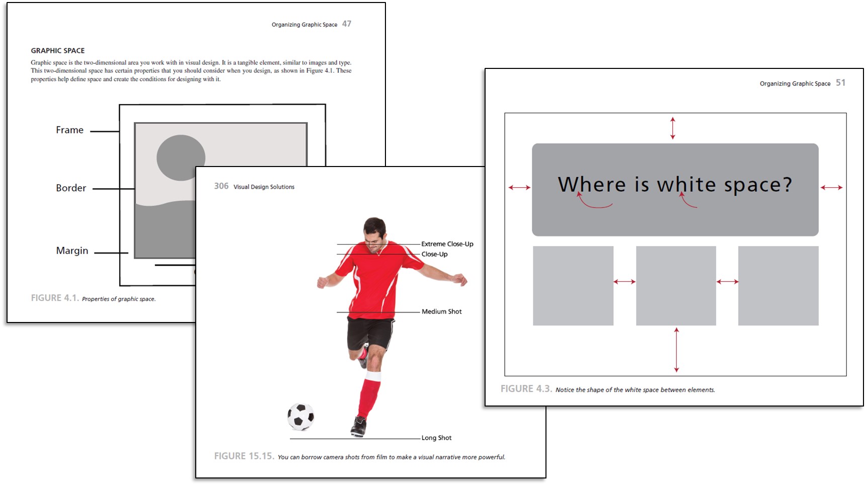
Connie’s book does a great job of giving people the basics of a visual vocabulary:
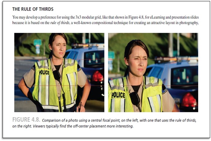
 I got particularly excited over the first explanation of the Rule of Thirds that I actually understood:
Visual Design Solutions: Principles and Creative Inspiration for Learning Professionals Paperback – April 13, 2015 by Connie Malamed (available in all the usual places).


My question would be whether I have to have visual sense to understand the book Doesn’t look like it (good!) …
Yes! It’s totally accessible for somebody who’s new to visual design
Excited to see this book is out now. Am a huge fan of the previous one and have been waiting for this one. Can’t wait to buy it.
I’m buying it. I had a personal conversation on Twitter with the author on whether or not I’d “get it,” as I’m a visual no-nada! I look forward to changing that just a little. And how nice of her to respond personally. She must indeed be nice!
Yes the photo does use the rule of thirds, but it also zooms in to the face to create interest. Not a well explained example.
Fair enough, but to be clear, it’s not a complete excerpt of the book explanation — I just snipped a bit of it. The book goes into quite a bit more detail